


Published on the 25/03/2020 | Written by Heather Wright
Geospatial data isn’t just showing us where infection is, it’s helping prevent the spread…
During World War II war rooms featured big tables with model ships and planes pushed around a map like a grown up game of Battleships. Fast forward to 2020 and today’s war room is digital, and it’s harnessing geographic information systems extensively to help on a range of fronts.
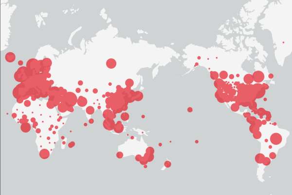
Geospatial data has been front and centre for many millions around the world in recent weeks, as we anxiously peer at the interactive maps, such as that from Johns Hopkins University, showing the spread of Covid.
But it’s not just about graphics to help everyone easily understand the spread or magnitude of the issue. Geographic information systems (GIS) might be most public as the technology underpinning those interactive maps, but it’s also providing a means of investigating and understanding the spread of the virus, and providing guidance for governments and health organisations implementing control measures.
Time-enabled maps can reveal how infections spread over time and where interventions might achieve the greatest impact, while also enabling governments and organisations to map capacity, from medical resources to goods and services and even citizens.
GIS can map boundaries around areas of known infection to trace who may have been exposed to infection and how transportation routes, for example, could compound the spread.
Crucially, in some cases GIS and datasets are being used in the critical task of contact tracing, mapping information such as credit card transactions and mobile phone location data to identify where those infected by Covid have been and who might have come in contact with them.
Contact tracing is proving to be one of the strongest weapons in the battle against Covid-19 – and something some Asian countries have excelled at. New Zealand’s contact tracing however, has been under constant fire as being too slow and inefficient. Earlier this week Dr Ayesha Verrall, an infectious diseases doctor and epidemiologist at the University of Otago, Wellington called for an escalation of contact tracing abilities locally.
“We should aim to leave the lockdown in one month with the ability to identify and trace the contacts of 1,000 cases a day. We are currently struggling with 50.”
China’s ‘close contact detector’ platform enables citizens to check for themselves whether they might be at risk. Accessed via popular mobile social and payment apps in China, the platform uses data from public authorities about the movement of people on plains and trains, combined with case records to check if a user has had close contact with someone infected, or suspected of being infected.
“GIS aids investigations into social networks to see and assess the spread within groups,” say Este Geraghty and Ryan Lanclos in an Esri blog.
“This analytical approach helps scientists and policy makers develop the epidemiologic curve for the virus and enhance the traditional model with maps that show the disease’s spread across space and time to deepen understanding and inform actions globally.
“Looking at the spread of disease risk from a more granular perspective, investigators use GIS to map boundaries around areas of known infection to trace who may have been exposed to infection and how transportation routes, for example, could compound the spread.”
The same location intelligence tools are enabling authorities in many countries to contact people who have, without their knowledge, been within an infected person’s orbit, the pair note.
New Zealand’s Critchlow Geospatial meanwhile, has developed an Emergency Management Map focused on vulnerable people and infrastructure within New Zealand.
Managing director Steve Critchlow says the company has taken the experience it gained in 15 years of putting together emergency management systems – predominantly for Australia – to build the ‘authoritative’ map for New Zealand.
Designed and built specifically for application at a nationwide level, the Emergency Management Basemap is available free to all non-commercial users.
Critchlow says his interest in developing the map came several years ago after a visit to a retirement village.
“People in retirement villages weren’t showing up on maps because the individual houses aren’t individually owned – they’re all just owned by the provider, such as Ryman or Bupa,” he says.
That blind spot meant agencies didn’t necessarily have a clear view of numbers of vulnerable people in a single place.
The Emergency Management Map includes all rest homes and campgrounds along with medical facilities, hospitals, and facilities such as petrol stations, supermarkets and ports.
“When something turns really bad, these are the critical things you need to keep going and to protect.”
The map was used for police briefings during last year’s Nelson fires. “It was a nice simple way of looking at information, but you can also see how many people live in each area and might need to be evacuated, how many doors needed to be knocked on and so how many police you had to send out.”
But Critchlow says there’s also applications for it during the pandemic, particularly if cordons or checkpoints are required, or the government implements exclusion zones around areas of particular vulnerability, such as rest homes.
“Accurate and updated mapping is invaluable when planning and responding to events. We’re providing a model of the country, effectively.”